Brand refresh for a long-established Harrow accountancy built to match the firm it already was.
ClientKBMD Chartered Accountants
IndustryChartered certified accountancy
Year2023
ServicesBrand identity
LocationKenton, Harrow
01Stage 01 of 03
The challenge.
KBMD Chartered Accountants has served clients from Kenton, Harrow since 1996 — a book built on long client relationships and referrals, with a team carrying more than fifty years of collective professional experience across audit, tax, payroll and advisory. The firm's reputation in the North-West London accountancy market was firmly ahead of its identity: the visual brand dated from an earlier era, sat awkwardly on contemporary stationery and pitch documents, and no longer reflected the standard of work or the seniority of the client roster.
The brief was a brand refresh that would feel inevitable rather than reinvented — something a chartered certified accountancy firm of KBMD's standing could introduce to existing clients without explanation, and put in front of new prospects without apology. Crucially, the work had to recognise the firm's quiet, relationship-led commercial model. KBMD does not win business through marketing volume; the brand needed to support the personal credibility of partners and senior staff in pitch and meeting environments rather than carry the firm on its own.
02Stage 02 of 03
The approach.
Professional services brands fail in two predictable directions: generic corporate, or overly modern and uncomfortable on a tax return cover sheet. KBMD needed neither.
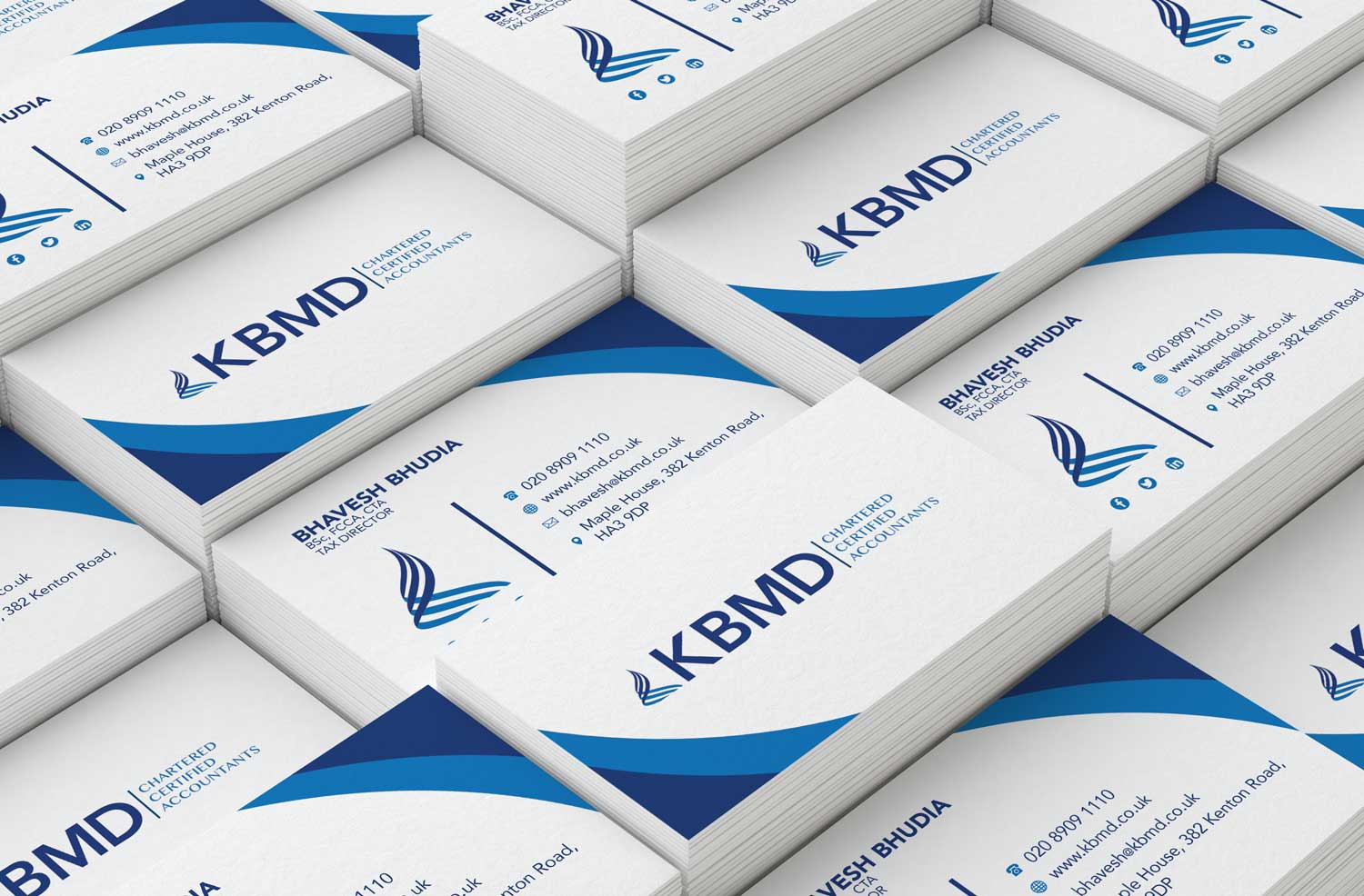
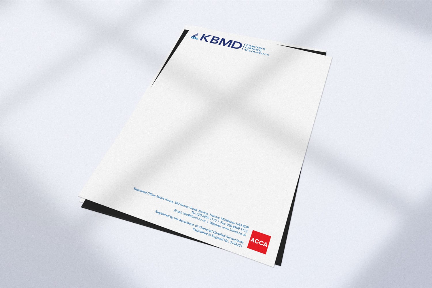
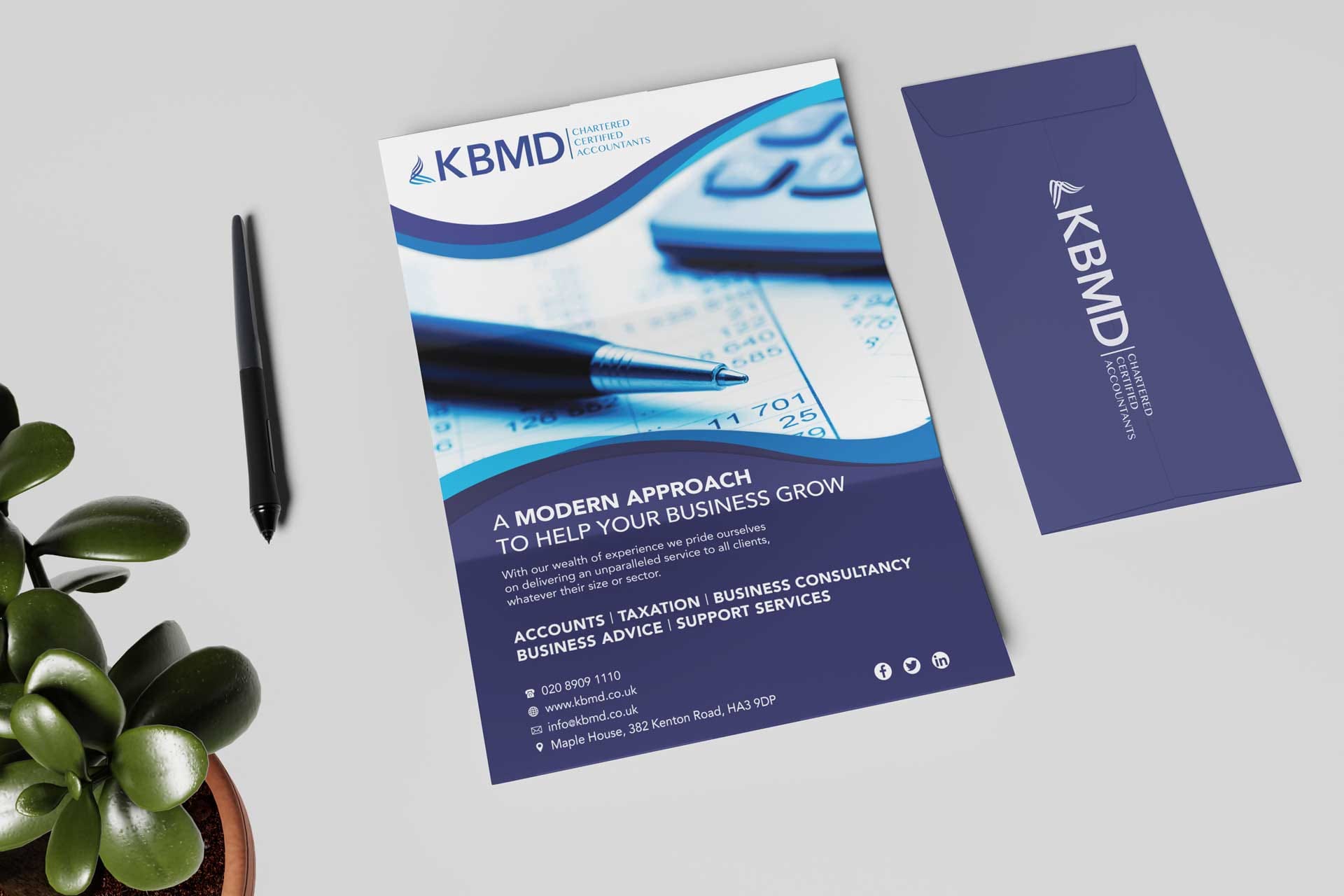
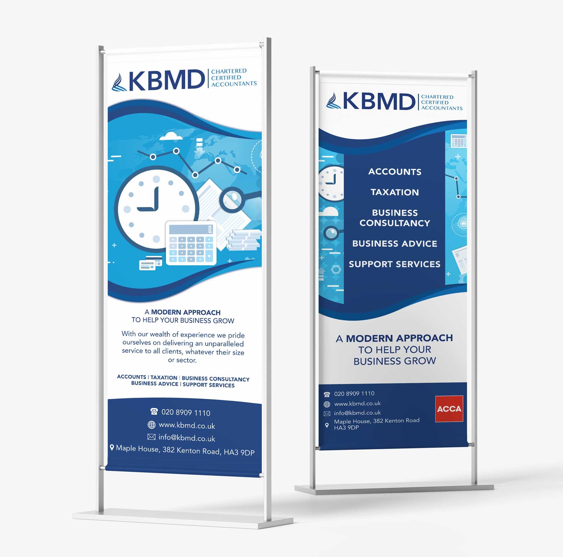
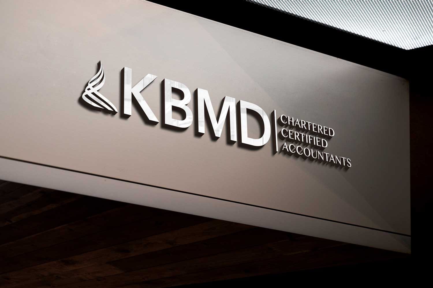
The new wordmark was built from custom letterforms drawn on a single geometric logic, with the K and B sharing a stem — a quiet, deliberate signature of partnership embedded in the mark itself. The palette was reduced to one deep signature colour and a metallic accent reserved for premium applications: embossed business cards, letterhead, pitch covers, report bindings. The type system pairs an editorial serif for headings and numerical work with a neutral humanist sans for body copy. No illustration, no iconography, no decorative flourish — every element earns its place by working harder, not by being louder.
The result reads as considered on premium printed stock and equally at home in a digital pitch deck or PDF tax-planning report. Quiet, correct, legible at every scale.
03Stage 03 of 03
The outcome.
A complete chartered accountancy brand identity system was delivered: the wordmark, palette and typography as the foundation, supported by business cards, letterhead, pitch and report templates, email signatures, and full written brand guidelines for the team. Each artefact was produced to a specification suitable for the print and digital contexts a working accountancy practice operates across — embossed and foiled stocks for premium client-facing material, plain-paper templates for routine correspondence.
The refreshed identity has continued to serve KBMD across day-to-day client work, pitch material and the firm's wider professional presence in the Harrow and North-West London accountancy market. The system is being used internally by the team without further design support, and the brand has settled comfortably into the firm's established commercial style — recognisable to long-standing clients, credible in front of new ones, and built to age well across the next phase of the practice.
If something here resonates with where you're heading, the next step is a thirty-minute call. No slides, no fluff — leave with a concrete plan whether we work together or not.